Feb 22, 2022
Evolution of my portfolio
Designers are notorious for consistently redesigning their personal websites. For some of us, our portfolio sites are a reflection of our work, experience and personality all in one place. Because of that, it is always a challenge when trying to build one that truly represents us. The pressure makes it hard to execute which then leads to procrastination. This recent redesign of my personal site took me 2.5 years (on and off). It only got completed when I gave myself a strict deadline. In my opinion, it is harder to design for ourselves vs others due to the personal attachment. Here are the top three reasons why I usually rebuild my portfolio site.
Learn new technologies#
New frameworks and libraries come out frequently and more often than not, you can't use them during your day job. Your portfolio site can be a great playground for trying the latest technologies.
Enhance design skills#
When I made the switch from print design to web/product design, I needed to work on a bunch of side projects in order to enhance my skill and become confident with my design process. My portfolio site gave me the place where I can hone my skills without any negative consequences.
Establishing a brand#
No matter if you create one or not, we all have a personal brand. Establishing one could open many opportunities for you. Like with anything great, it takes time, patience, and persistence to get it done right. Once you find that direction, you will stand out from the crowd and become an expert in your field. With that, lets explore the progression of my personal website from a design and technology perspective:
V1#

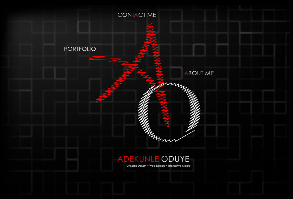
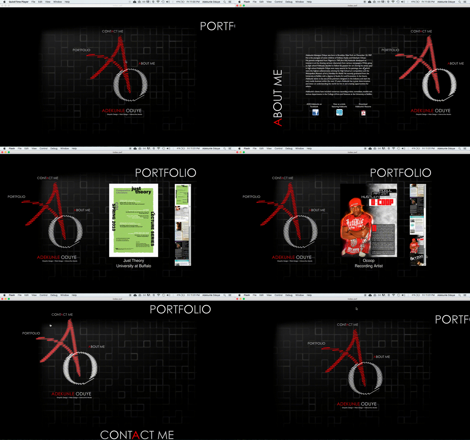
This was a Flash website that I built from a video tutorial (I was really hyped for the animation and sound effects). I also learned ActionScript which helped me pickup Javascript a couple years later.

V2#
![[object Object]](/images/blog/portfolio-v2.png)
When flash got killed by the Apple and Steve Jobs, I needed to pivot. In my day job we were using PHP and I decided to use it for my next site. Let's just say that this was one of the few times I touched PHP (No shade, it's a good language but it isn't for me 🤷🏿♂️).
V3#
![[object Object]](/images/blog/portfolio-v3.png)
When I helped build the site for SassConf, I was introduced to the ruby based static site generator Middleman. This was my first experience working in a Ruby and RubyGems environment, which was refreshing.
V4#
![[object Object]](/images/blog/portfolio-v4.png)
This was also built on Middleman. For this version I wanted to explore using serif fonts and animation.
V5#
![[object Object]](/images/blog/portfolio-v5.png)
The first iteration was built in GatsbyJS. I ditched it when I got plugin errors from upgrading Gatsby. I moved to NextJS and it has been a great experience. For my blog and portfolio pages I’m using MDX. The combination of markdown and react components simplified the process of page layout. Since some of my past work can't be shown publicly, I used JWT to control which projects are visualable based on the authorization level. SendGrid is used for the contact form and Mailchimp for capturing emails for my newsletter.
As you can see, a portfolio website can be a playground for learning new skills. Your site doesn't have to be a Basquiat for it to be released to the public. Because like any product that is out there, iteration will make it better over time.
